Toggle navigation
Allison Murray Design
My work
In a nut shell
Clients
News
Say
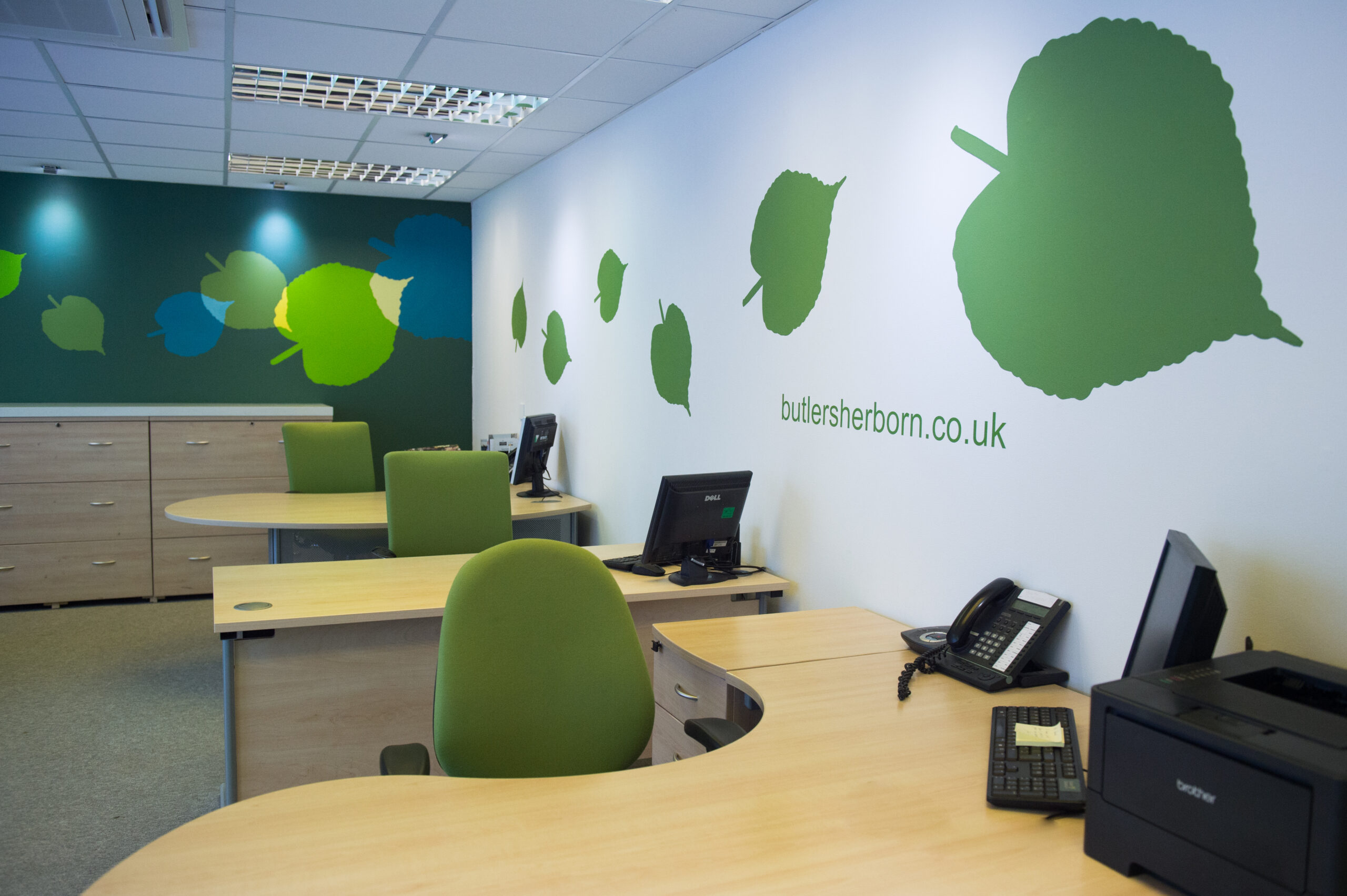
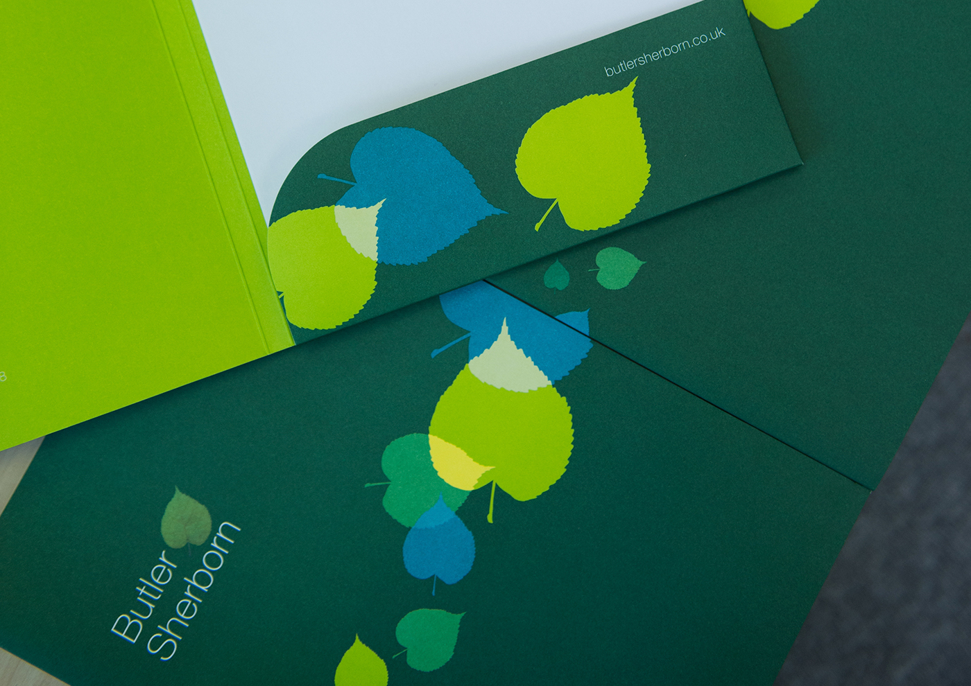
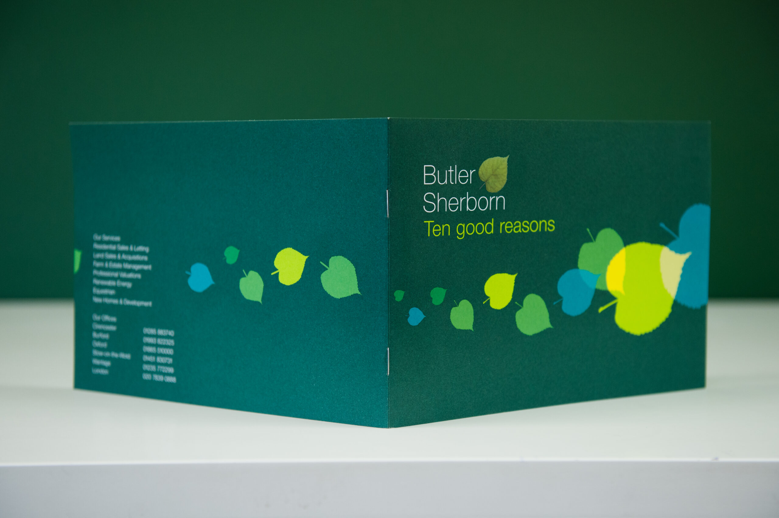
Butler Sherborn
An evolution of the Butler Sherborn leaf branding was needed to reinvigorate the estate agency look and strengthen their presence in a very competitive arena. Turning the leaf into a graphic element, expanding a more vibrant colour palette and honing their tone of voice created a more dynamic and eye-catching look. This was then taken across all their marketing material and interior design. This was followed with an illustration style which is used across brochures and advertising.
All
Brand Creation
Identity
Brochure Design
Packaging
allison@allisonmurraydesign.com
Chase me!
Allison Murray Design Brummells Barn Eastleach Gloucestershire GL7 3NG
01367 850056